Published on: January 22, 2026
Affiliate Disclaimer:
Some of the links in this post are affiliate links. This means we may earn a small commission if you click through and make a purchase, at no extra cost to you. We only recommend tools we truly believe offer value.
1. Why Canva AI Designs Look Professional at First — Then Disappoint
We’ve all had that moment: Canva generates something in two seconds, we think “wow, this is actually good”… and then we look again. The layout feels a bit too “template.” The typography doesn’t match our vibe. The colors are close, but not ours. And suddenly the result looks like something everyone else could post.
That’s the exact trap with Canva AI designs in 2026. They often look polished at first glance because Canva is excellent at clean alignment, spacing, and visual balance. The problem starts when we try to use that same output as a real brand asset—something we’d confidently put on a website, in an ad, or on a professional Instagram feed.
Here’s what many of us are noticing: Canva AI designs tend to optimize for “generally good,” not “specifically you.” And that tiny difference is what makes a design feel either credible or generic.
In this guide, we’ll keep it practical. We’ll learn why Canva AI designs sometimes lose impact after the first impression, what signals make them look amateur without us realizing, and the exact steps that make Canva AI designs feel truly professional—without spending hours tweaking.
If you’ve ever thought “This is good… but something is off,” you’re in the right place.
If you want to understand why some Canva AI designs look polished while others feel generic, Designing With Type is a humble but powerful place to start. It explains the fundamentals of typography (hierarchy, spacing, readability) so we can make smarter design choices — even when Canva does the first draft.
2. The Reason Canva AI Designs Look Generic
If Canva AI designs often feel generic, the reason is simpler than it looks — and it has very little to do with your skills.
Canva AI is built to create designs that work for everyone. To do that, it relies on safe layouts, neutral typography, and widely accepted color combinations. These choices reduce the risk of “bad” design, but they also reduce personality. What we get is something that looks correct, yet rarely feels distinct.
Design theory explains this clearly. Professional-looking visuals rely on contrast, hierarchy, and emphasis to guide the eye and communicate intent. When these elements are weak or evenly distributed, designs appear flat and interchangeable. Canva AI defaults often aim for balance and readability first, which is helpful — but not enough to express a brand or a clear visual voice.
A good reference that explains these fundamentals in plain language is Figma’s overview of design principles, which breaks down why hierarchy, contrast, and intentional choices matter in visual communication: Figma Design principles.
Another key issue is missing constraints. When we don’t clearly define brand colors, fonts, spacing rules, or visual priorities, the AI fills those gaps with defaults. Defaults are designed to be neutral. Neutral designs rarely stand out, especially in feeds full of similar content.
This is why Canva AI designs often look impressive at first glance, then disappointing on a second look. The AI isn’t failing — it’s stopping exactly where human judgment is required. Once we understand this boundary, we can stop fighting the tool and start guiding it. And that’s where professional results begin.
3. What Canva AI Does Well — and Where You Need Human Control
Here’s the shift that changes everything: Canva AI designs are excellent at structure, but limited at judgment. Once we separate those two roles, Canva AI suddenly becomes much easier to work with — and far more useful for creating professional results.
Think of Canva AI as a fast assistant that sets the stage. It’s great at arranging elements, keeping spacing clean, and avoiding obvious mistakes across Canva AI templates. What it can’t do (yet) is decide what matters most for your message, brand tone, or visual identity. That part — especially when aiming for Canva AI professional designs — still needs us.
To keep this practical and easy to scan, here’s the split that really helps:
| Canva AI Does This Well | You Still Need to Decide This |
|---|---|
| Clean alignment and spacing | What should visually stand out |
| Readable font combinations | Which font fits your brand tone |
| Balanced layouts | Where hierarchy should be stronger |
| Fast first drafts | Final polish and brand consistency |
This is why Canva AI designs often feel almost right. The foundation is solid, but the emphasis is missing. And emphasis is what turns a layout into communication.
A useful mindset is this: let Canva AI handle the “where,” and keep the “why” for yourself. Use it to explore layouts quickly, then step in to reinforce hierarchy, adjust contrast, and simplify the message. These small interventions are what make designs feel intentional instead of automated.
Once we stop expecting Canva AI to decide for us, and start using it to support our decisions, the experience becomes faster, calmer, and far more professional.
4. Step-by-Step: How to Make Canva AI Designs Look Professional
This is the part most people are actually searching for. Not theory — what to do, in what order, to fix results today.
The biggest mistake is trying to “fix” a Canva AI design after it’s generated, without preparing the ground. Professional results come from three simple phases: before, during, and after AI generation.
Before You Generate: Give AI Fewer Choices, Not More
Before clicking Magic Design, take one minute to reduce ambiguity.
What helps immediately:
Set brand colors and fonts (even basic ones)
Decide one clear goal (post, slide, ad — not “something nice”)
Choose a reference layout you already like
When AI has fewer decisions to guess, results improve dramatically. Canva itself explains that AI tools work best when guided by clear structure and constraints, not open-ended prompts: check here the help page of Canva if you need.
During Generation: Don’t Chase the “Perfect” First Result
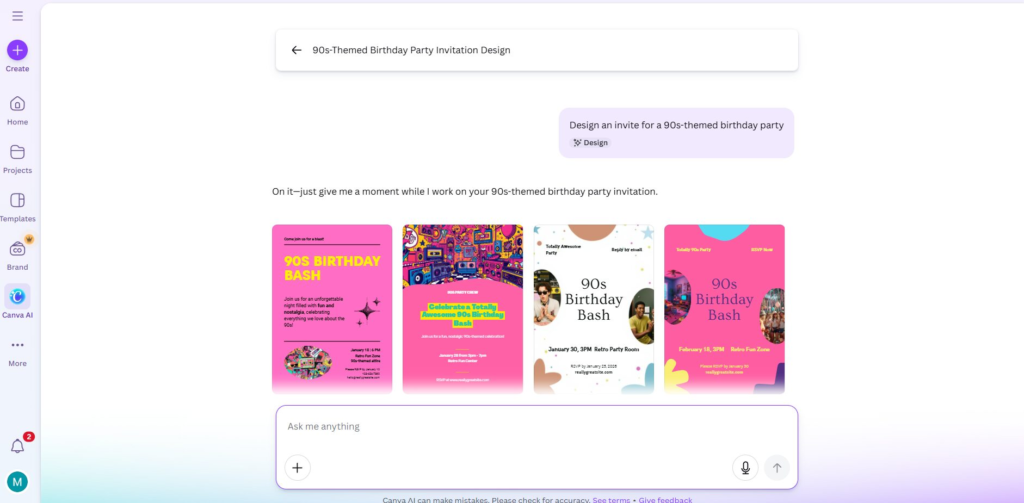
Here’s a counterintuitive rule: the first AI result is rarely the one to keep.
Instead:
Generate 2–3 variations
Ignore colors and fonts at first
Look only at layout logic (spacing, balance, hierarchy)
At this stage, Canva AI is most useful as a layout explorer, not a final designer.
After Generation: Always Do These 5 Fixes
This is where most “generic” designs become professional.
Always adjust:
Typography hierarchy → one clear headline, one supporting text
Contrast → make one element clearly dominant
Spacing → remove clutter, add breathing room
Color restraint → fewer colors, stronger identity
Alignment → nothing should feel “almost centered”
Design resources consistently show that hierarchy and contrast are the main factors separating amateur from professional visuals. Figma’s design principles explain this clearly and practically: here the principles.
Use AI Again — But Only for Micro-Tasks
Once the structure is solid, AI becomes useful again.
Good uses:
Rewriting short text blocks
Suggesting alternative headlines
Creating icon variations
Bad uses:
Regenerating the entire layout
Letting AI override typography decisions
Chasing scores or “AI suggestions”
A Simple Rule to Remember
Use Canva AI to start fast. Use human judgment to finish strong.
When you follow this flow — prepare → explore → refine — Canva AI stops feeling generic and starts feeling like a real productivity tool.
In the next section, we’ll look at the limits and risks of relying too heavily on AI for design, especially when branding and trust are involved.
If you wish to have some visual help, here there is a nice video sharing useful information on the topic:
5. Limits, Ethics, and Brand Risks When Using Canva AI
As Canva AI designs become part of everyday creative work, it’s worth slowing down for a moment. Not to reject the tool — but to use Canva AI responsibly and with clear boundaries. This is where many creators, especially beginners using Canva AI templates, unintentionally run into problems.
The first limit is brand dilution. When we rely too heavily on Canva AI designs generated layouts without clear visual rules, designs start to look interchangeable. Over time, this weakens recognition. If every post, slide, or banner follows the same visual logic, audiences stop associating the design with us and start associating it with the tool.
Another common concern is over-automation. Canva AI is designed to help, not to replace judgment. When every decision — from font size to color contrast — is delegated to AI, Canva AI professional designs may look fine individually but inconsistent as a whole. Professional credibility comes from repetition and intent, not from constant variation.
There’s also a privacy and ownership aspect to keep in mind. While Canva states that user content remains owned by the creator, AI features may analyze Canva AI designs to improve the system. It’s important to be cautious with:
-
confidential client materials
-
early brand concepts
-
sensitive business visuals
Canva’s own documentation explains how AI features interact with user content and data, and it’s worth reviewing this if you use AI tools regularly in professional contexts: document here.
Finally, there’s a reliability issue that’s easy to overlook. AI-generated design trends change fast. What looks modern today may feel dated in a few months if it follows the same popular patterns used by thousands of others. Human-led refinement is what keeps designs grounded and timeless.
A healthy approach is simple: use Canva AI for speed and structure, but protect identity, consistency, and intent with human decisions. When those roles are clear, AI becomes a support system — not a creative shortcut that quietly erodes trust.
6. How to Use Canva AI Without Losing Control (Final Takeaway + FAQ)
If there’s one thing this guide should make clear, it’s this: Canva AI designs don’t become professional by default — they become professional when we stay in control.
Canva AI is extremely good at speeding up the starting phase: layout exploration, spacing, and basic visual balance. Where it stops is exactly where quality begins — decisions about hierarchy, tone, brand consistency, and emphasis. That handoff is not a flaw. It’s the design boundary between automation and intention.
A useful mindset going forward is simple:
Use Canva AI to move fast.
Use human judgment to decide what matters.
When we treat AI as a helper instead of a finisher, Canva AI designs stop feeling generic and start feeling deliberate, consistent, and credible.
FAQ
Q: Is Canva AI good enough for professional design work?
A: Yes, as a starting point. Professional results come from refining typography, hierarchy, and brand consistency after AI generation.
Q: Why do Canva AI designs look generic so often?
A: Because AI prioritizes safe, neutral layouts unless clear brand constraints and visual rules are provided.
Q: Do I need Canva Pro to get professional results?
A: Not strictly, but features like Brand Kits, font control, and asset management make consistency much easier and faster.
Q: Can Canva AI replace a designer?
A: No. It replaces repetitive setup tasks, not creative judgment, brand thinking, or strategic design decisions.
Q: What’s the best long-term way to use Canva AI?
A: Use it to speed up structure and exploration, then apply human decisions to finalize and differentiate the design.
If this guide helped clarify why Canva AI designs often look generic — and how to make them look professional, you may also want to explore a few related topics where creators often struggle with control, consistency, and trust in AI-assisted creativity. We’ve already covered these in depth on AIDigitalSpace:
→ Midjourney Prompt Hacks – Get Better Images with Smarter Prompts
→ How to Create AI Images That Don’t Look Fake (Simple Fixes)
→ AI Visual Storytelling Guide: Turn Ideas Into Stories with Gamma

