 Published on: December 05, 2025
Disclosure:
This post contains affiliate links. If you click through and make a purchase, we may earn a small commission at no additional cost to you. Thank you for supporting AIDigitalSpace — we only recommend tools and services we genuinely trust and believe bring real value to our readers.
1. What People Really Want: A Logo That Looks Professional, Not AI-Generated
Most people comparing looka vs logomaster just want one thing: a logo that looks professionally designed, not something that feels generic or “AI-made.” Branding today moves fast, and users expect clean, sharp visuals without learning design rules.
Here’s what readers are really looking for:
A logo that looks unique and polished
A ready-to-use brand kit for social media and websites
A simple tool that produces consistent visual identity
Clear commercial rights to use the logo anywhere
This is why the looka vs logomaster comparison matters: both tools promise “professional” results, but they take very different approaches.
Quick Snapshot: What Users Care About Most
Does it look professional?
Is it easy to customize?
Does it give full branding assets?
Is the price worth it?
Recommended Read:
If you’re building a brand or choosing between AI logo tools,
“Building a StoryBrand” by Donald Miller is one of the most practical books you can read.
It helps you clarify your message so your visuals — including AI-generated logos — feel strong, clear, and truly professional.
2. The Common Problem With AI Logo Makers (And Why Looka vs Logomaster Matters)
Most people compare looka vs logomaster because AI logo generators often produce designs that look too similar or too “template-like.” The issue isn’t the tools — it’s that many users don’t know which platform gives more control, better variation, or stronger branding assets.
Here are the pain points we repeatedly see in real user behavior:
Logos feel generic or repeated across industries
Color palettes don’t match the brand personality
Icons look disconnected from the company purpose
Users don’t know whether commercial rights are included
The final logo doesn’t work well on websites, packaging, or social media
A well-known design usability study by Nielsen Norman Group confirms this trend: people instantly judge professionalism based on first-glance logo quality, and low-quality designs dramatically reduce trust.
This is why the looka vs logomaster comparison is relevant: users want the tool that avoids these common traps and produces designs that look clean, modern, and usable everywhere.
When choosing between the two, here’s the real question to ask yourself:
Which tool gives me a logo I can confidently put on my landing page, Instagram bio, and product packaging — without it looking AI-made?
If you feel unsure, testing both is still the fastest way to understand the difference in style quality.
3. Looka vs Logomaster: The Core Differences That Actually Matter
When people compare looka vs logomaster in any AI logo maker comparison, they’re not looking for long feature lists — they want to know which tool delivers the most professional results with the least effort. Both platforms aim to be the best AI logo generator, but they approach design and branding in very different ways.
What Looka focuses on
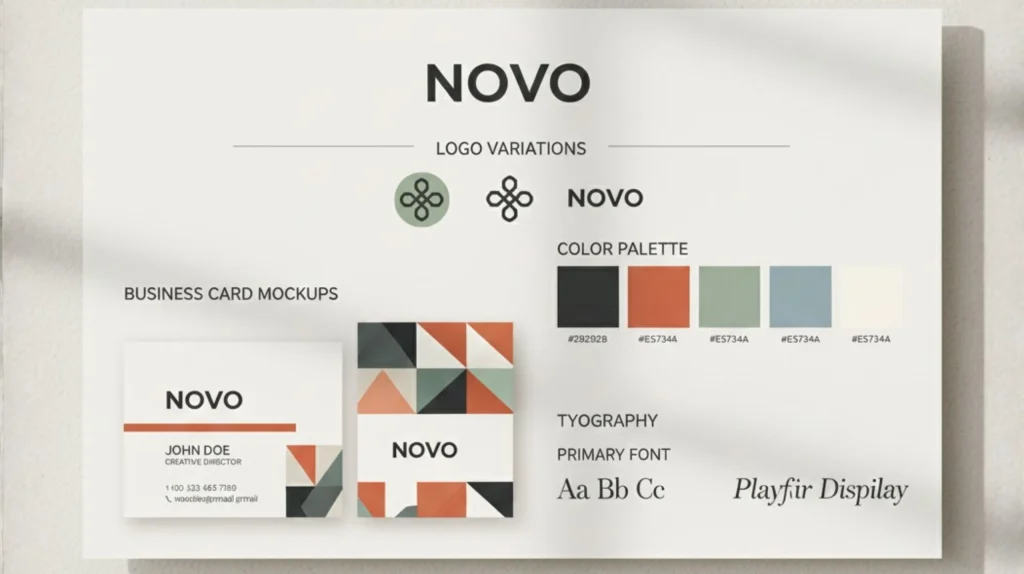
Brand-first approach: You get a full brand kit (colors, fonts, social templates).
More polished templates: Better for modern, minimal, startup-friendly styles.
Beginner-friendly workflow: Very fast to generate clean results.
Great for multiple touchpoints: Web, packaging, Instagram, ads.
What Logomaster focuses on
More custom icon variations: Useful if you want something less template-driven.
Simple editing tools: Quick adjustments to symbols, shapes, and color.
Straightforward pricing: Ideal for users who want a single logo download.
Flexible export options: Works well for merch, banners, and larger formats.
Quick comparison snapshot
| Feature | Looka | Logomaster |
|---|---|---|
| Design Quality | Modern, minimal, startup-ready styles | Broader icon library, more variation |
| Brand Kit | Full kit: colors, fonts, templates, social assets | Basic exports, no full brand system |
| Customization | Beginner-friendly, limited deep editing | More control over icons, shapes, layout |
| Ease of Use | Very fast & intuitive | Simple, direct, but more manual |
| Export Formats | PNG, SVG, EPS, PDF + brand kit files | PNG, SVG, EPS (depending on plan) |
| Commercial Rights | Full ownership included | Full ownership included |
| Best For | Startups, creators, online businesses needing brand consistency | Small businesses, merch designers, users wanting more icon flexibility |
According to design industry guidance from Adobe, a strong logo system depends on consistency, versatility, and recognizability — not just an icon. This is where the differences between these two tools really stand out.
Simple insight
Choose Looka if you need a complete brand presence.
Choose Logomaster if you want more control over icon style and variations.
Both give fast results, but the experience — and the final look — can feel very different.
4. How Each Tool Builds a Logo: What to Expect Step by Step
When users compare looka vs logomaster, the biggest difference isn’t just the features — it’s how each tool guides you through the logo creation workflow. In a real AI logo maker comparison, this step-by-step experience matters more than people think. Here’s what to expect in practice so you can quickly see which platform feels more aligned with your style.
How Looka Builds a Logo (Fast + Brand-First)
Looka is designed for users who want a clean, professional look with minimal effort.
Workflow:
Enter brand name + slogan
Choose styles you like (modern, minimal, geometric…)
Pick colors and symbols
AI generates polished logo concepts
Edit fonts, layout, spacing
Instantly preview the full brand kit
What stands out:
You get brand previews on real mockups (websites, cards, socials)
The output feels consistent, even if you’re not a designer
Perfect for startups, creators, coaches, and online businesses
How Logomaster Builds a Logo (Flexible + Icon-Driven)
Logomaster gives more variation and icon control, which is why some users prefer it.
Workflow:
Enter business name + industry
Choose preferred styles
Select icons from a wide library
AI creates multiple variations
Manually adjust icons, shapes, and layout
Export in multiple formats
What stands out:
Strong icon diversity for niche businesses
Better for users who want more editing control
Clean, simple interface with direct options
If you want deeper icon flexibility, Logomaster usually wins in the looka vs logomaster comparison.
Quick Practical Difference
Looka → Faster, more curated, more polished visuals.
Logomaster → More variations, more manual adjustments.
This aligns with expert guidance from NNGroup on how structured design systems often produce more trustworthy, professional-looking visuals.
5. Where Looka Wins, Where Logomaster Wins (Real Use Cases)
After testing both tools, most users comparing looka vs logomaster end up deciding based on one simple question:
Do I want a complete brand system or deeper control over icons and variations?
Below is the clearest way to understand when each tool delivers the best results.
When Looka is the Better Choice
Looka wins when you need a fast, polished brand identity without doing much manual editing.
Looka is ideal if you:
want a modern, professional look with minimal effort
need a full brand kit (colors, fonts, templates, social previews)
are launching a startup, personal brand, or digital-first business
care about consistent visual identity across platforms
prefer a smooth, guided workflow that “just works”
Paired with a design tool like Canva Pro, Looka’s brand kit becomes extremely powerful for ongoing content creation.
When Logomaster is the Better Choice
Logomaster wins when you want more variations and icon flexibility, especially for print-heavy or niche use cases.
Logomaster is ideal if you:
want more control over icons, shapes, and layout
are designing for merch, signage, or packaging
don’t need a full brand kit, only a strong standalone logo
prefer trying many icon styles before choosing
want simple pricing focused on logo downloads
Summary table
| Criteria | Looka | Logomaster |
|---|---|---|
| Best For | Startups, creators, and digital brands needing a full identity system | Small businesses, merch designers wanting deeper icon control |
| Brand Kit | Complete kit including colors, fonts, templates, social previews | Basic logo exports only |
| Design Style | Modern, minimal, polished | Wider icon diversity and symbolic options |
| Editing Experience | Very guided and beginner-friendly | More manual shape, icon, and layout control |
| Ideal Use Cases | Web, social media, ads, landing pages | Merch, signage, print materials |
| Speed | Very fast — polished results in minutes | Fast, but usually more tweaking |
| Try Looka Free | Try Logomaster |
Simple Decision Shortcut
Choose Looka → if you want a fast, polished, ready-to-use brand kit.
Choose Logomaster → if you want more icon flexibility and hands-on editing.
6. How to Get More Professional Results With Either Tool
Even if the comparison looka vs logomaster highlights two very different approaches, the final quality of your logo still depends on the decisions you make during creation. With a few simple adjustments, both tools in this AI logo maker comparison can produce results that look far more professional and much less “AI-generated.”
1. Start with a clear brand message
The biggest mistake is creating a logo before knowing what your brand represents.
Define:
Who you help
What you offer
The personality you want to communicate (modern, friendly, premium…)
A clear direction immediately leads to stronger logo outputs.
Recommended read from your site: AI Free Tools for Designers (2025 Guide) — great for improving visual decision-making.
2. Choose styles that match your industry
Avoid generic styles. Look for:
Minimal for tech and digital services
Geometric for modern brands
Soft curves for wellness and lifestyle
Bold shapes for sports or equipment businesses
Both platforms respond strongly to style inputs, especially Looka.
3. Use colors intentionally (not randomly)
Color psychology matters more than people think.
Blue → trust, tech
Green → fresh, eco
Black/white → premium
Orange → energy, creativity
4. Test multiple layouts before deciding
In looka vs logomaster, Looka’s layouts feel more curated, while Logomaster gives more variations.
Try:
icon above text
icon beside text
horizontal layouts for websites
stacked layouts for social media
Consistency across platforms = professional appearance.
5. Check scalability (small and large formats)
Your logo should look good at:
24–48 px (favicon, app icon)
200–600 px (website header)
print sizes (merch, packaging)
Logomaster’s SVG exports are especially useful for print-heavy brands.
6. Use a brand kit (or create your own)
If you choose Looka, the brand kit is already included.
If you choose Logomaster, you can build your own in Canva Pro or Notion by collecting:
color palette
fonts
spacing rules
logo variations
This keeps your identity consistent everywhere.
7. Final Insights and How to Choose the Right Tool for Your Brand
By now, the real difference in the looka vs logomaster comparison is clear: both tools can create a strong logo, but the right choice depends on the type of brand identity you want to build in this broader AI logo maker comparison.
Choose Looka if you want a fast, polished, and consistent brand system.
Choose Logomaster if you prefer more icon variety and hands-on design control.
Here’s a simple way to think about it:
- If you want your brand to look professional everywhere — from your website to Instagram — Looka gives you a complete visual identity with almost no friction.
- If your focus is symbol quality, variation, and experimenting with different icon shapes, Logomaster offers more creative flexibility.
Most users get the clearest insight by trying both tools with the same brand name and comparing which logo feels more aligned with their personality and industry — the most reliable method when evaluating looka vs logomaster side by side.
8. FAQ: Looka vs Logomaster — Common Questions Answered
Q: Which tool creates more professional-looking logos in the Looka vs Logomaster comparison?
A: Looka usually delivers more polished, modern visuals with minimal editing, while Logomaster offers more icon flexibility and variation.
Q: Is Looka or Logomaster better for building a full brand identity?
A: Looka is better if you want a complete brand kit with colors, fonts, templates, and social media previews. Logomaster is more focused on standalone logo creation.
Q: Which platform is more affordable when comparing Looka vs Logomaster?
A: Logomaster is typically cheaper for a single logo purchase, while Looka becomes more cost-effective if you need a full brand system rather than just one file.
Q: Do both Looka and Logomaster include commercial rights?
A: Yes, both platforms include full commercial usage rights once you purchase your logo, so you can use it on websites, packaging, merchandise, and marketing.
Q: Which tool is easier for beginners?
A: Looka is more guided and beginner-friendly, while Logomaster offers more manual adjustments that may appeal to users who want deeper icon or layout control.